The QuorumVoice brand.
The logo, the mark, colour and type, and how to use them. Use these files as they are, and when in doubt, give the logo room.
QuorumVoice, in writing.
Use QuorumVoice as one word with a capital Q and V. The lowercase spelling belongs to the logo artwork. Quill is the name of our AI assistant.
Keep the names clear.
Write “QuorumVoice” for the platform. Use “Quill Concierge” for AI answering and “Quill Assistant” for help with your records.
Sound like a helpful teammate.
Use plain language, concrete actions and honest claims. Explain what someone can do. Avoid jargon, exaggerated promises and implying that Quill is a person.
One sentence
QuorumVoice is a shared business phone and inbox with AI answering, keeping calls, texts, emails and meetings on one contact timeline.
A little more context
QuorumVoice brings business calling, texting, email and meetings into one shared workspace. Quill answers calls and texts using the organization’s knowledge, and helps the team find answers in its conversation history. Recordings, transcripts, summaries and follow-ups stay connected to the people behind each conversation.
Mark and name, together.
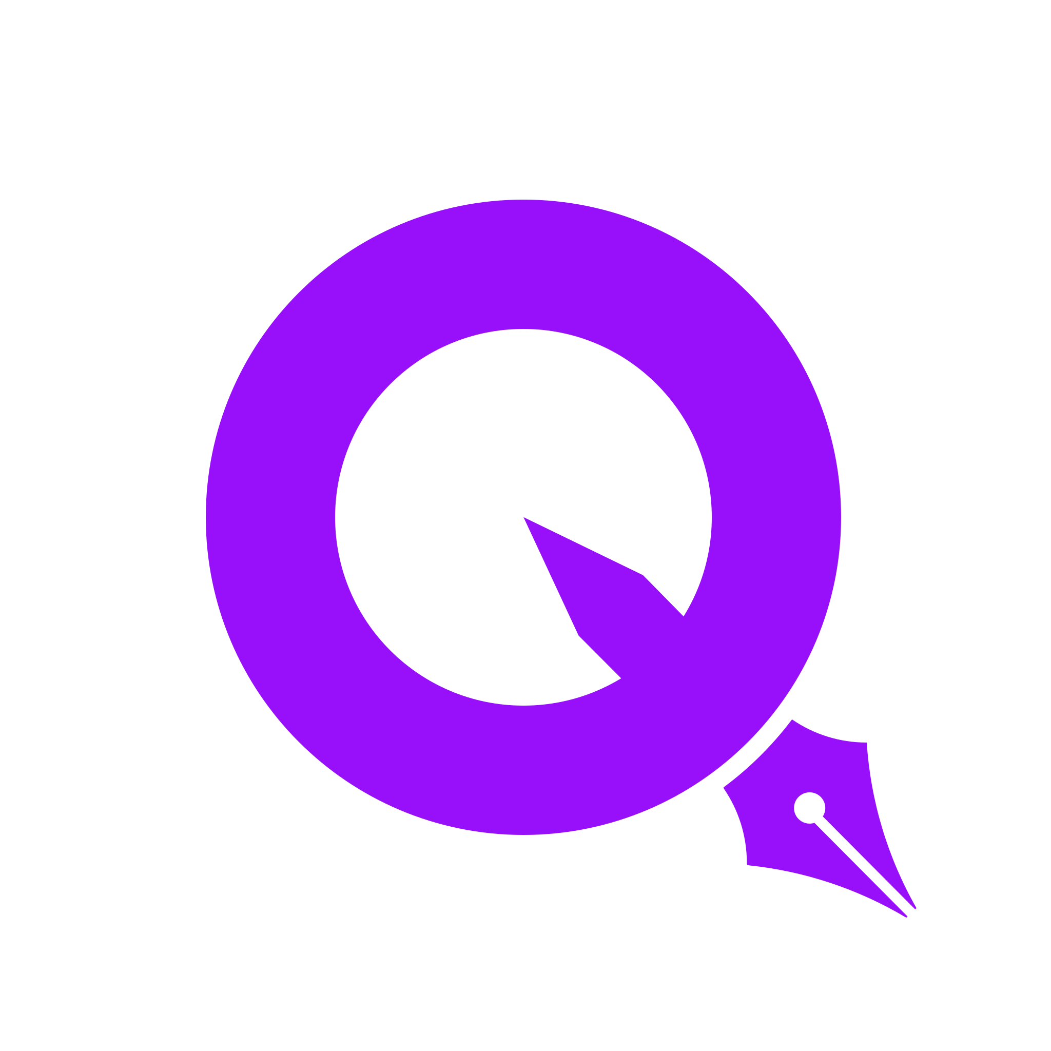
The Q whose tail is a pen nib, in its indigo-to-violet squircle, set close to the name in lowercase: quorum in Inter Bold, voice in Inter Regular and violet. It is the default wherever QuorumVoice signs its name.
Ink for quorum, violet #7C3AED for voice. White, paper and light photography.
White for quorum, #B39DFF for voice, so it keeps its contrast. Ink and deep dark surfaces.
The Q-and-nib.
Use the mark alone where the name is already said nearby, or where there is only room for a square: app icons, avatars, favicons.
The gradient squircle. Use it for the logo, app icons and avatars.
The alternate, for round frames like profile photos. The glyph sits fully inside it.
For light backgrounds where a container would crowd it.
For one-colour print, stamps and embossing.
Give it room.
Keep clear space around the logo equal to the height of the q in quorum. Below 32px, use the mark alone rather than the lockup.
Indigo into violet.
The gradient is the brand's one accent: the mark, primary buttons and the rare highlight. Everything else is ink on white and paper.
Start of the brand gradient
End of the brand gradient; the mark on its own
“voice” in the name, on light backgrounds
“voice” in the name, on dark backgrounds
Text, the dark footer and dark surfaces
Cards and quiet panels on white pages
Inside the product and its illustrations, each kind of conversation keeps its own colour. Use them for channels only, never as decoration.
Pair colour with contrast.
Use these solid foreground and background pairings for readable text. Each meets the 4.5:1 minimum for normal text; channel colours still need their own contrast check.
#0B0B10 on #FFFFFF
#0B0B10 on #F4F3F1
#7C3AED on #FFFFFF
#B39DFF on #0B0B10
#FFFFFF on #4F39F6
#FFFFFF on #0B0B10
Take the palette with you.
Brand and channel colours, ready for your stylesheet.
Ratios apply to these opaque colours. Gradients, photographs and transparency need a fresh check. WCAG contrast guidance ↗
Inter, and two for the product.
The site is Inter throughout — display set tight at Medium 500, body regular, and the name pairing Inter Bold (700) with Inter Regular. Inside the app, headings take Plus Jakarta Sans and anything numeric takes JetBrains Mono.
on the record.
QuorumVoice answers after hours and files every call, text, email and meeting to the person it came from, so nothing lives only in someone’s cell phone.
ABCDEFGHIJKLM nopqrstuvwxyz
InterEverything on the marketing site, and the app’s body text. Display is set at 500 with tight negative tracking; body stays 400.
ABCDEFGHIJKLM nopqrstuvwxyz
Plus Jakarta SansHeadings inside the app (h1–h6). Rounder than Inter at a glance, which keeps dense product screens from reading as a spreadsheet.
ABCDEFGHIJKLM nopqrstuvwxyz
JetBrains MonoNumerals that must not jump: call timers, durations, phone numbers, code and keyboard keys.
A little texture. Plenty of room.
The engraved feather connects Quill to the written record. The dot field adds depth to open space. Both are supporting artwork; the Q-and-nib remains our identifying mark.
Keep the conversation.
Use violet at 7–9% opacity over a white-to-lilac wash, like our CTAs. Place one oversized feather at an edge, crop the outer barbs, and fade it away from the copy.
Leave a clear record.
Use a pale violet tint at low opacity. Keep the nib recognizable when it is visible, and leave text on a quiet part of the canvas. Avoid glows or a repeating feather wallpaper.
Space to focus.
Let the edges do the work.
Use a fine, evenly spaced grid. Fade it toward the copy and the edge of its section. Dots add atmosphere to a hero or footer; they do not sit behind forms, small labels or dense product content.
On phones, reduce the crop and intensity. Keep the words and controls in front, with decoration excluded from reading order.
Download feather maskOur TV spots.
Quill dips its nib, answers the phone and writes it all down, in the same ink, type and product you see on this site. Hover to preview; click to watch with sound.
Intros and outros.
Brand bumpers for our own videos, in two sets: the quill paints the stage in, or the Q flies through the camera and we come out inside. Each one is a solid stage that’s transparent at its edges in time, so it drops straight onto your footage. Put it on the track above your clip and overlap the edges.
Edge series. A new dimension.
A freestanding Q in our indigo-to-violet gradient. Fast edge reveals, kinetic type, live product motion, and a longer YouTube end screen ready for your video and channel overlays.
Please don’t.
The logo only works if it looks the same everywhere.
Don’t capitalise the logo artwork
Don’t set both words in one weight
Don’t stretch or skew the mark
Don’t recolour the gradient
Don’t put the colour mark on busy photos or the brand colour
Don’t add effects: shadows, outlines, glows
Take the files.
Vector SVGs of the logo and the mark, with the name drawn as outlines so they look right without the font installed, and transparent PNGs at twice that size for anywhere that won’t take an SVG. Scale them freely; don’t edit them.
The complete brand kit.
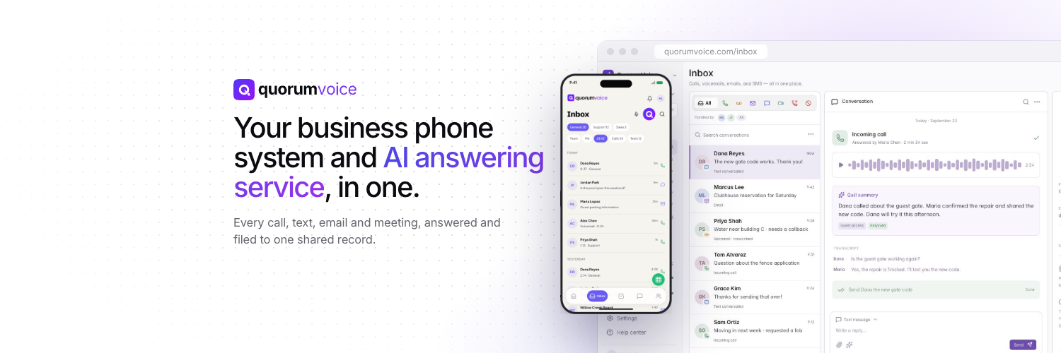
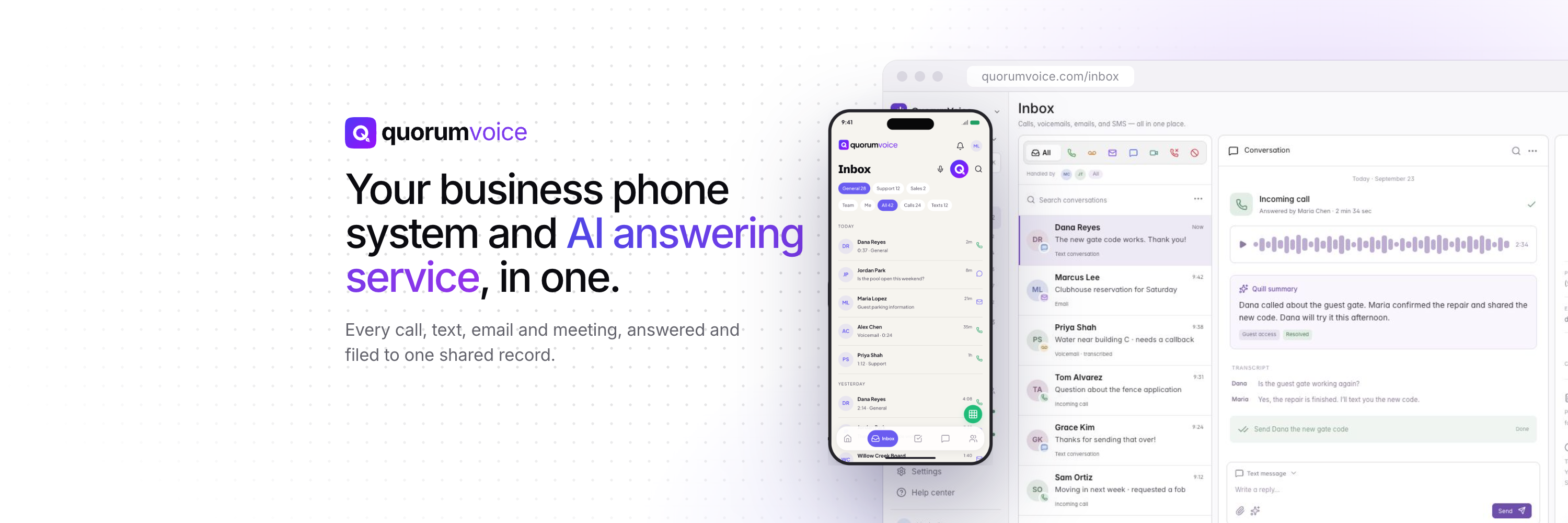
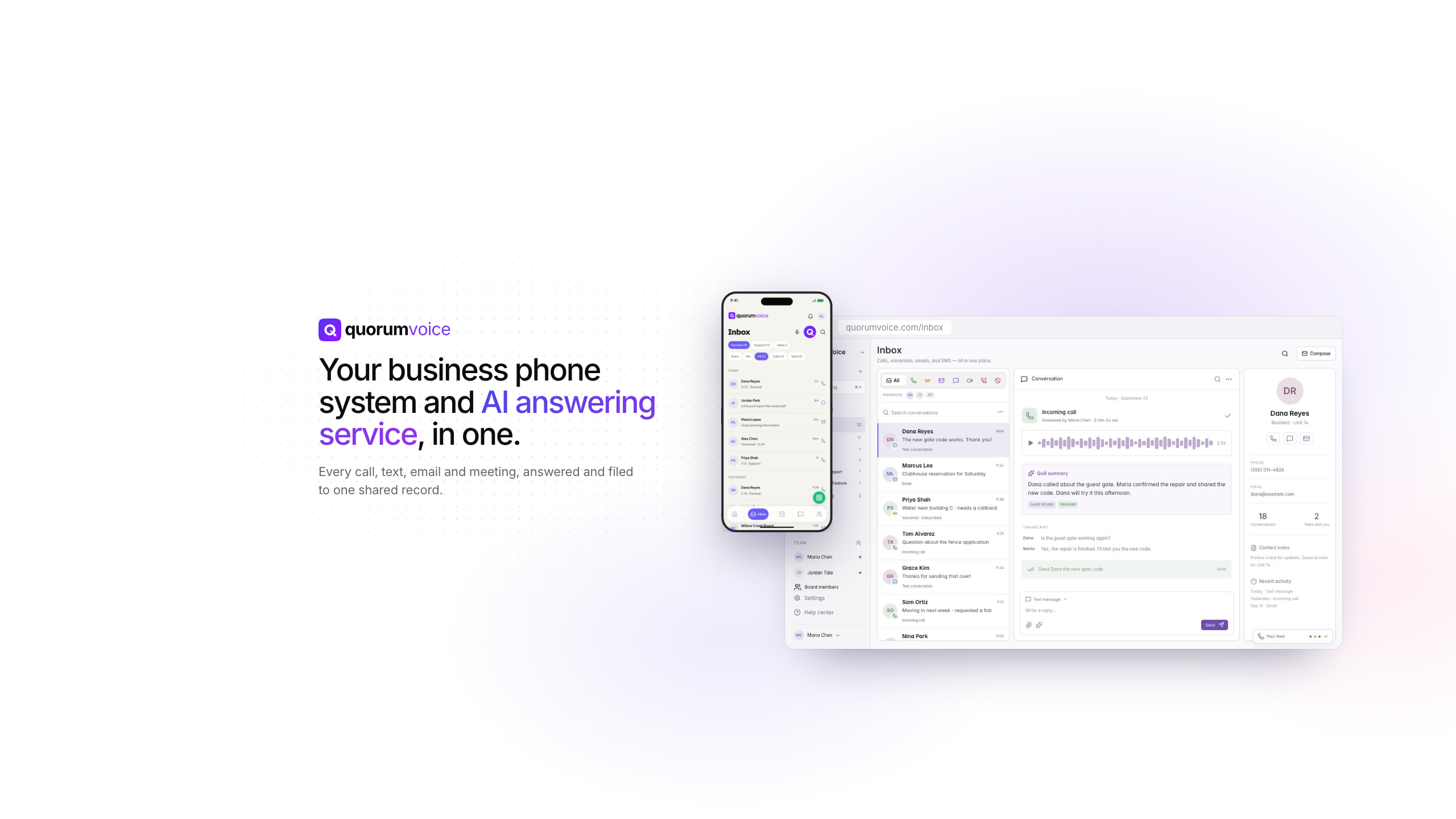
Logos, marks, existing social headers, feather mask, colour tokens and a usage guide.
Version 2026.09.25
Logo













Mark









Social headers
“QuorumVoice”, “Quill” and the QuorumVoice logo are trademarks of Inevital Labs, LLC. Questions about using them: support@quorumvoice.com.